Piet's Notes on Deep Creek Lake Science
Sensible Technologies - The Science of Deep Creek Lake
I’ve always wondered how well the Akima interpolation method performs in a complex environment such as the bathymetry of Deep Creek Lake. The Akima algorithm is used in the scientific community extensively in all kinds of applications. There are two forms of the Akima interpolation algorithm, linear and spline. How do they differ?
The ultimate question here is: How well does it work with the bathymetric data of Deep Creek Lake?
I spent a day working up a test problem and trying out various ways to demonstrate the “goodness of fit.”
I defined a grid of 100 x100 ft or miles, or whatever; units do not matter. For that grid, I computed a random set of x,y coordinates and z values. For ‘x’ and ‘y’ they were selected from a uniform distribution between 0 and 100, for ‘z’ they were selected from a normal distribution with the resulting values normalized to 100, equivalent, more or less, to the maximum depth value used in all of the bathymetric work.
I used the same color palette and breaks in water depth levels that were used to generate the final bathymetry map.
The idea was to produce contours and to plot the points on top of the map in the color that they should have assumed and visually check to see if they were located in the appropriate places.
In addition to the Akima interpolation procedure, I recently found another method in one of the R packages, labeled as MBA (R has thousands of functions collected in hundreds of packages and, because of the sheer number of them, its easy to miss some very useful ones).
The result of the current analysis is basically three sets graphs, with each set having 5 graphs. These graphs display:
1. A bar graph showing the colors and range of the color coding as provided by the palette used.
2. A scatter plot with just the color coded ‘z’ points. Note that the values of the points are also shown.
3. A graph with the Akima-linear interpolation results. and the color coded points superimposed.
4. A graph with the Akima-spline interpolation results and the color coded points superimposed.
5. A graph with the MBA interpolation results similar to the two Akima versions.
The three sets of images were run with a 20, 100 and 200 random points respectively with the results shown in Figure 1 through 15.

Figure 1. 20 Random Data Points to Be Interpolated
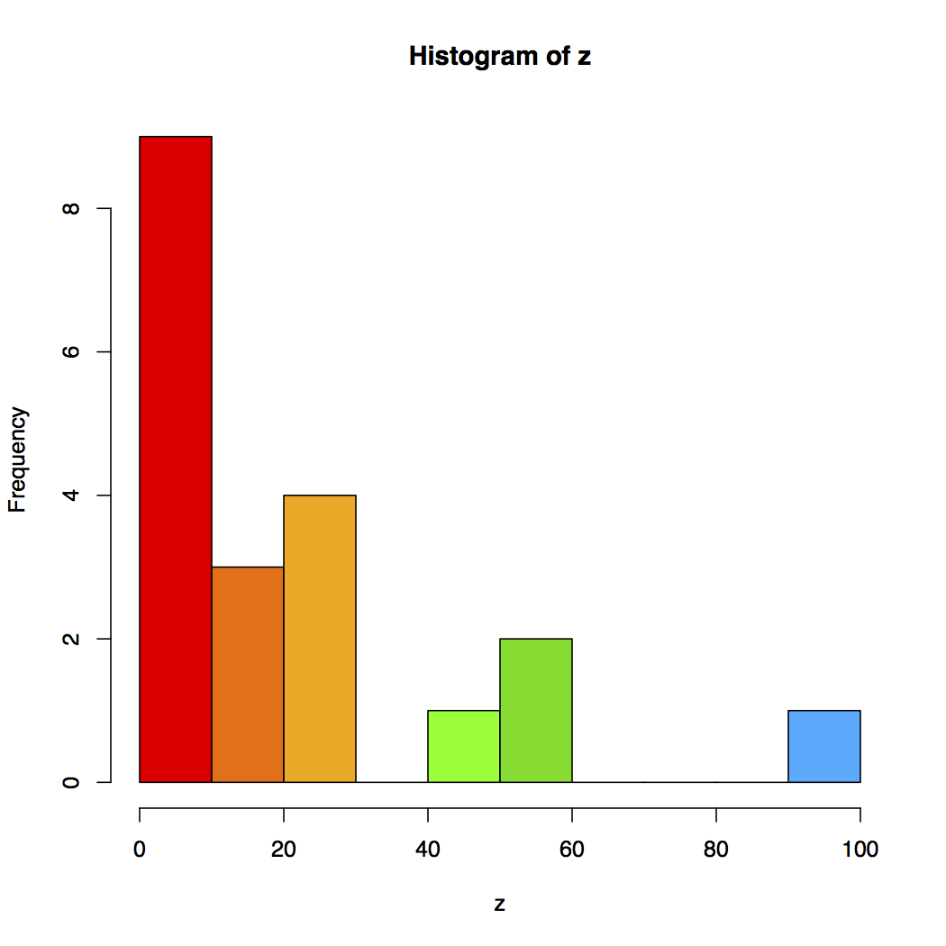
Figure 2. The Color Code of the 20 Random Data Points to Be Interpolated

Figure 3. Akima Linear Interpolation of the 20 Random Data Points
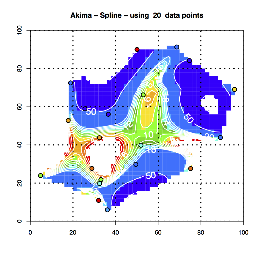
Figure 4. Akima Spline Interpolation of the 20 Random Data Points

Figure 5. MBA Interpolation of the 20 Random Data Points
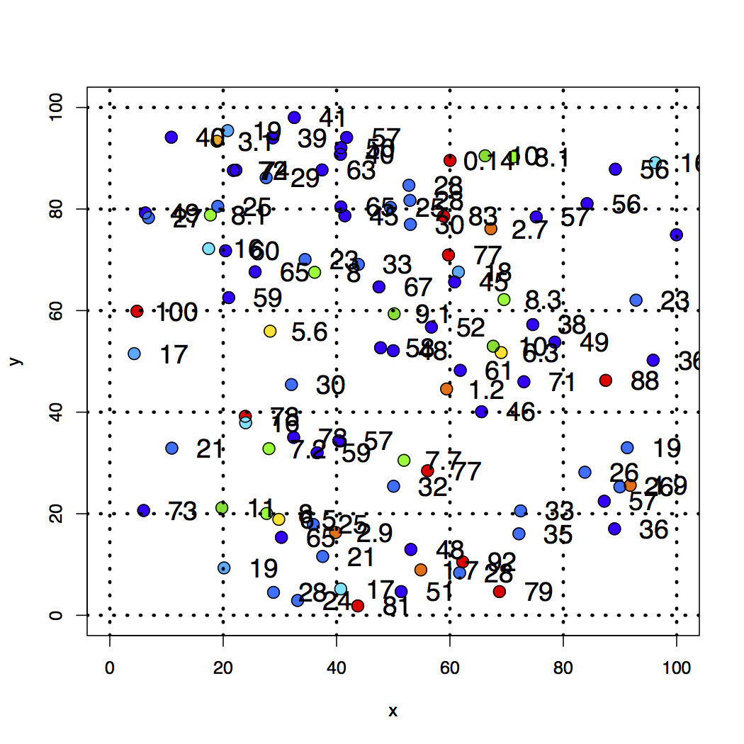
Figure 6. 100 Random Data Points to Be Interpolated
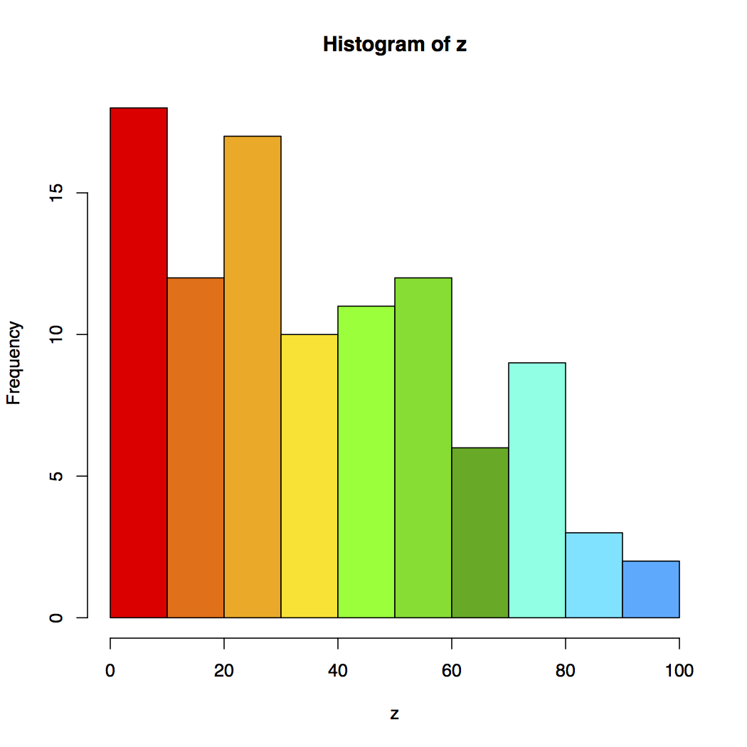
Figure 7. The Color Code of the 100 Random Data Points to Be Interpolated
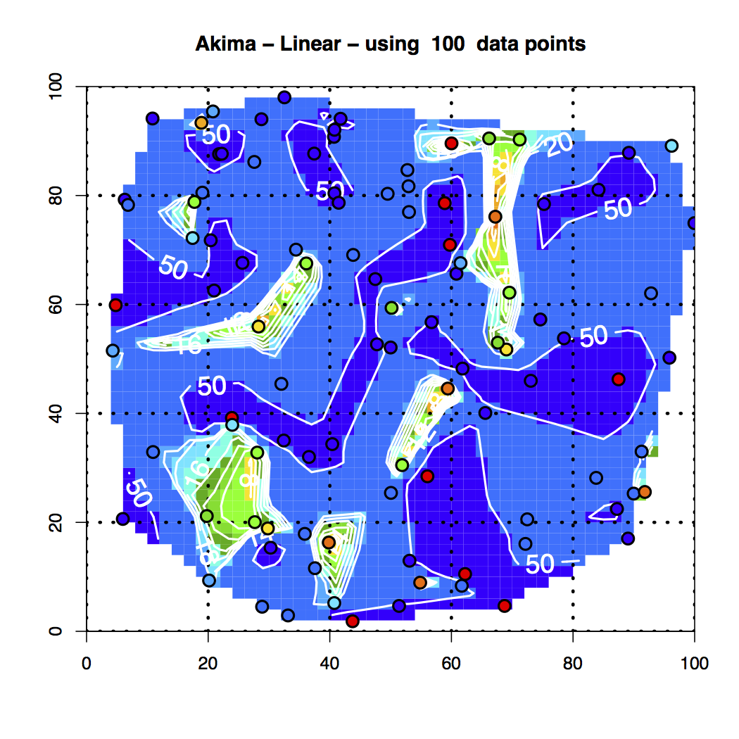
Figure 8. Akima Linear Interpolation of the 100 Random Data Points
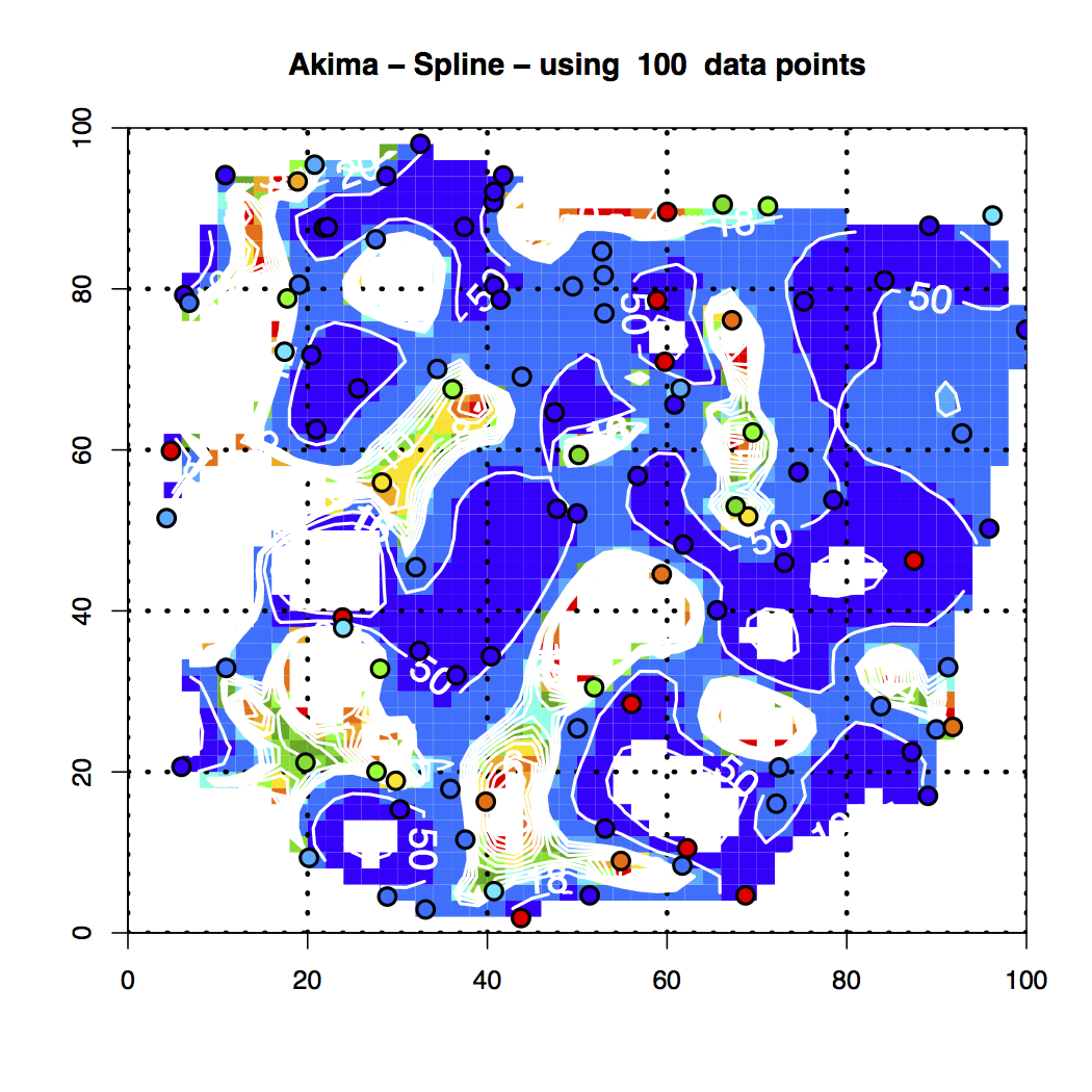
Figure 9. Akima Spline Interpolation of the 100 Random Data Points
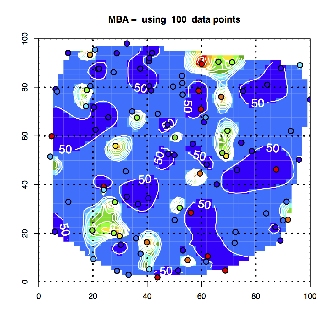
Figure 10. MBA Interpolation of the 100 Random Data Points
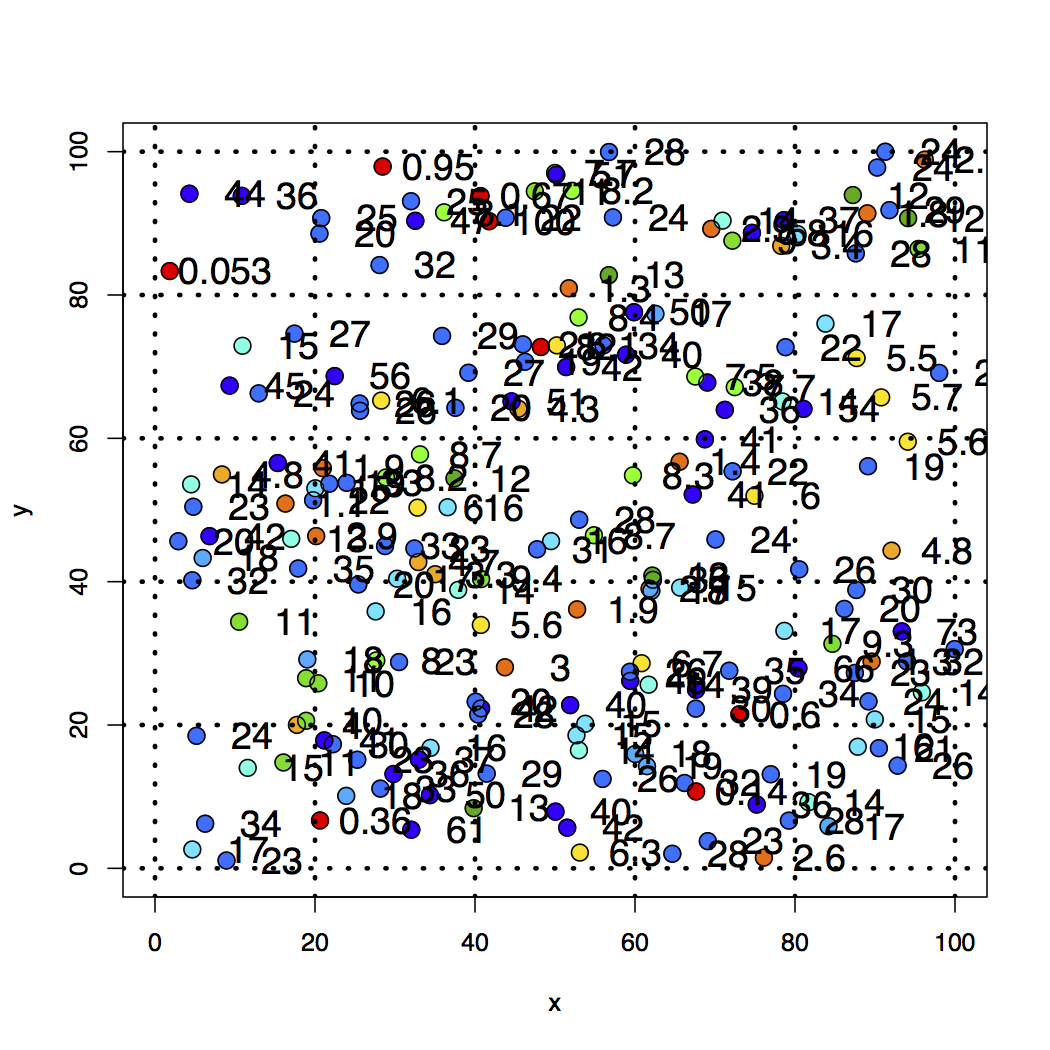
Figure 11. 200 Random Data Points to Be Interpolated
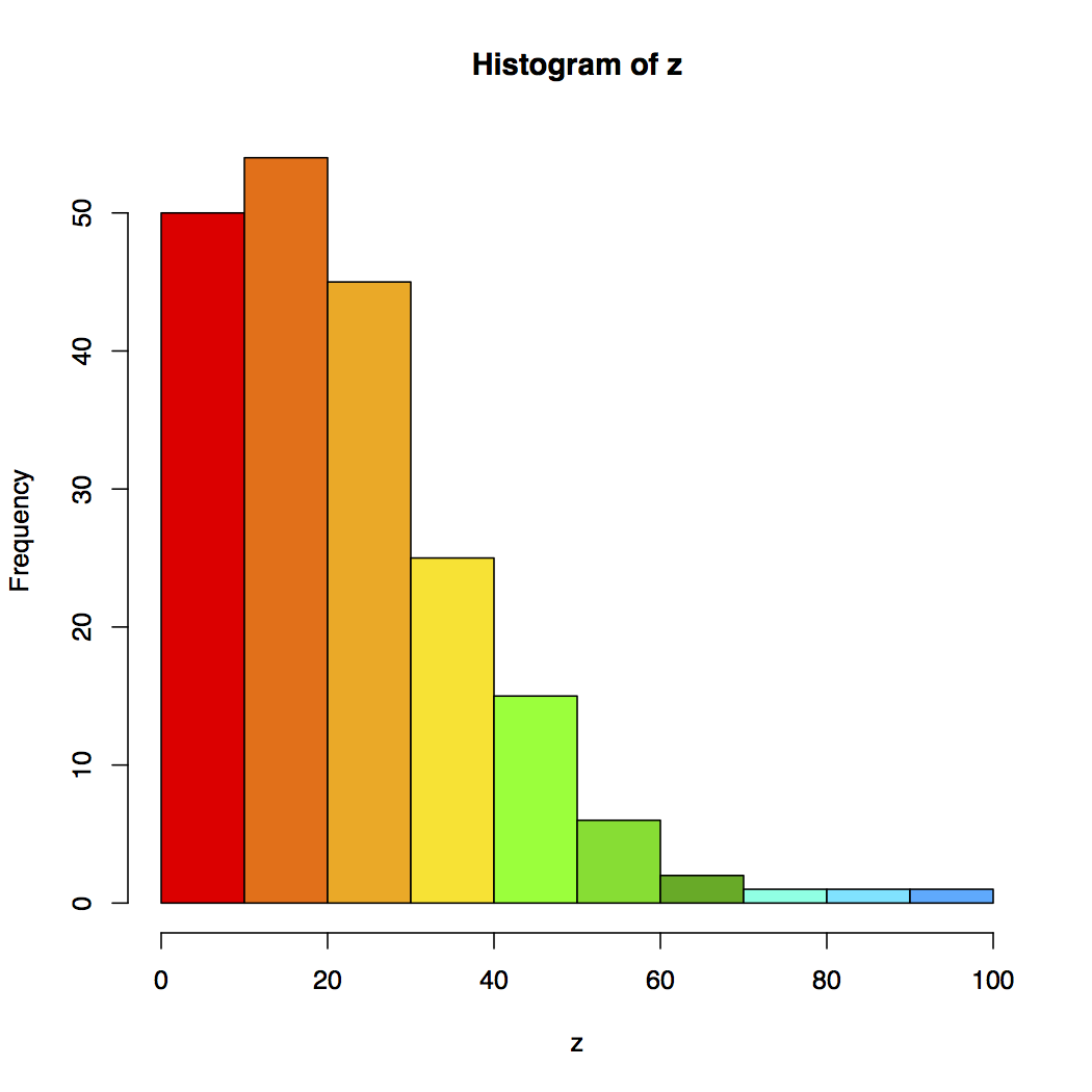
Figure 12. The Color Code of the 200 Random Data Points to Be Interpolated
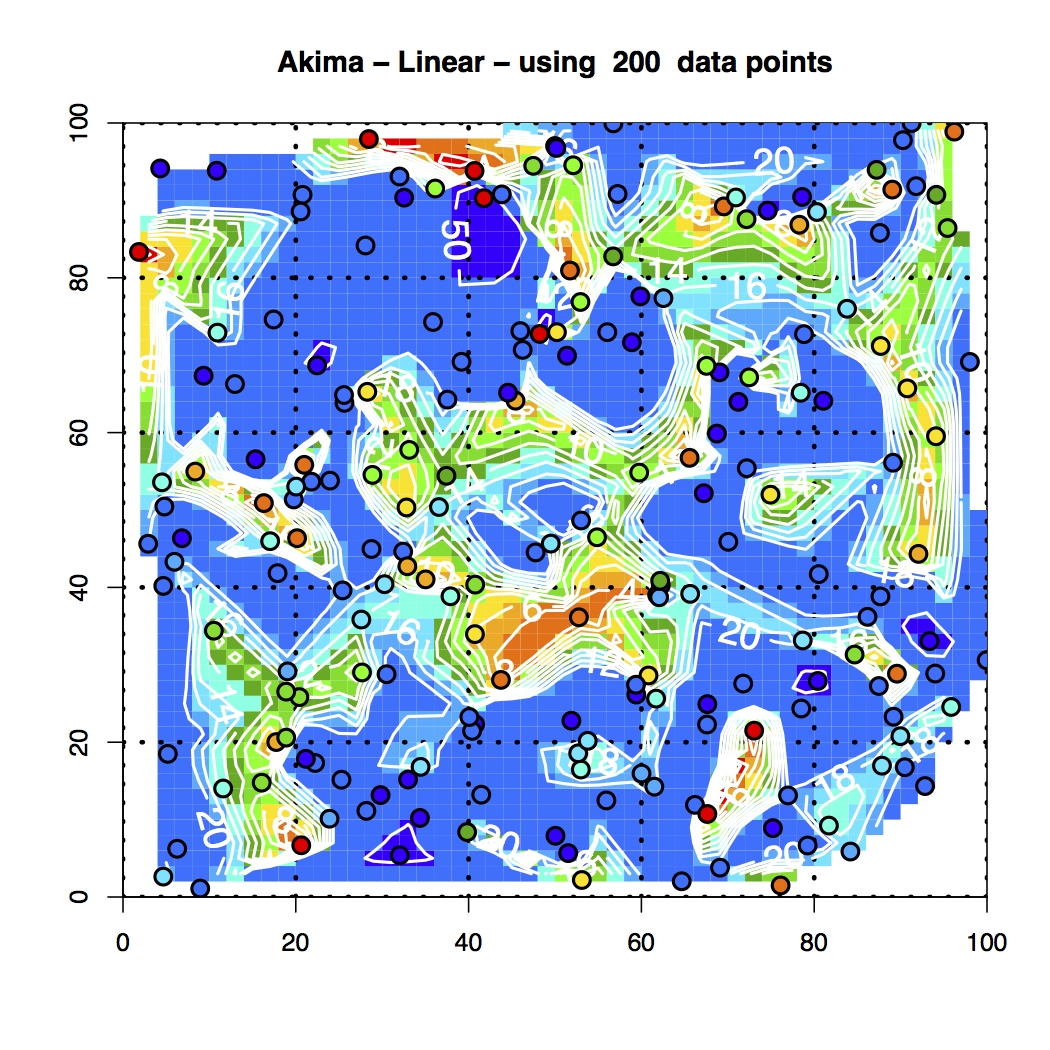
Figure 13. Akima Linear Interpolation of the 200 Random Data Points
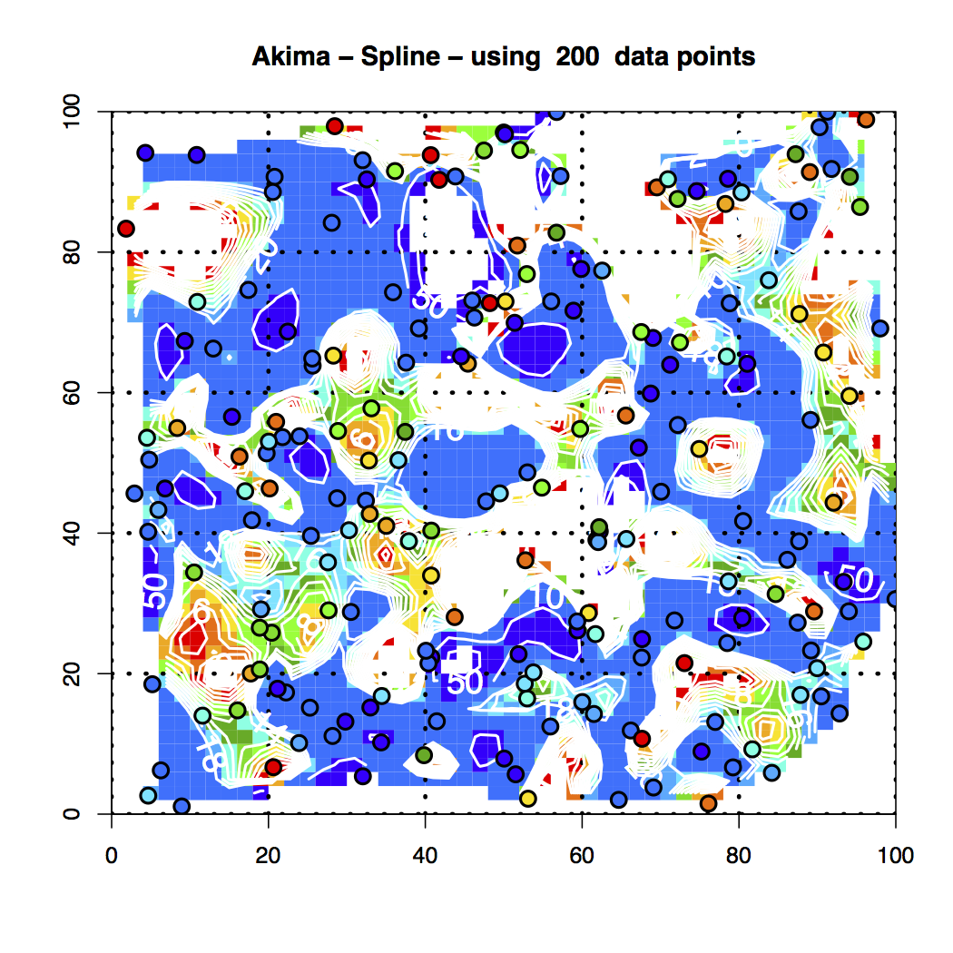
Figure 14. Akima Spline Interpolation of the 200 Random Data Points
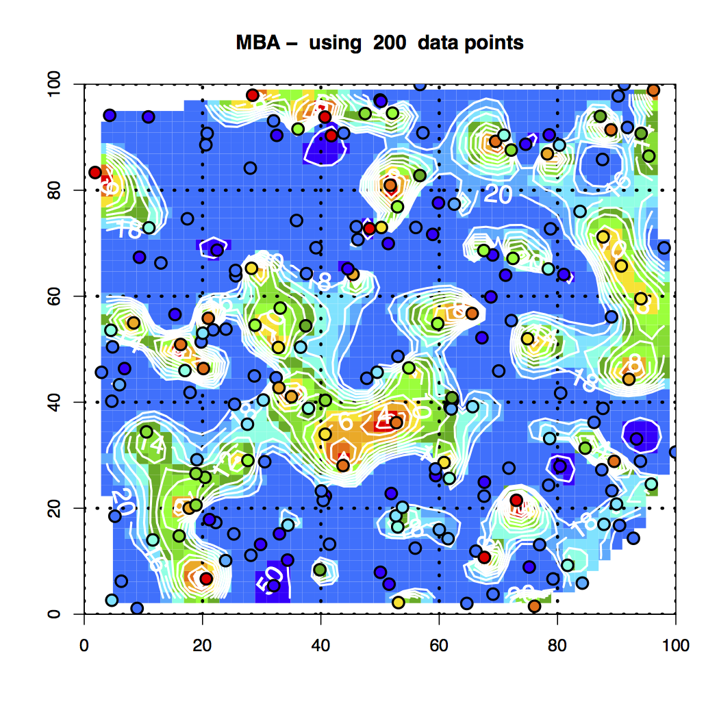
Figure 15. MBA Interpolation of the 200 Random Data Points
It’s readily seen that the various interpolation schemes do not match up, although they display nice behavior.
This requires further investigation.
PLV
First Published: 8/16/2013
Adapted for this website: 1/10/2018
Script Collection Here