Piet's Notes on Deep Creek Lake Science
Sensible Technologies - The Science of Deep Creek Lake
To show the nuances of water depth on bathymetric maps, the color scheme to mark the changes from one depth contour to the other is an important visualization task. This note shows graphically various schemes that may be suitable. Twenty-one schemes were evaluated. The schemes are first presented as small images, four to a page, after which a link is provided that allows one to download a detailed map of any of the 21 schemes looked at, and examine it’s impact. The one eventually chosen by the author is the very last scheme, scheme 21, or Figure 6b. What it shows pretty clearly, with easy-on-the-eye contrasting colors, is that the lake, as a whole, is shallower south of the Glendale bridge, especially the coves.
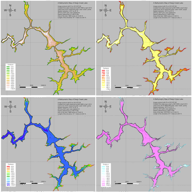
Figure 1. a. Upper Left; b. Upper Right; c. Lower Left; d. Lower Right.
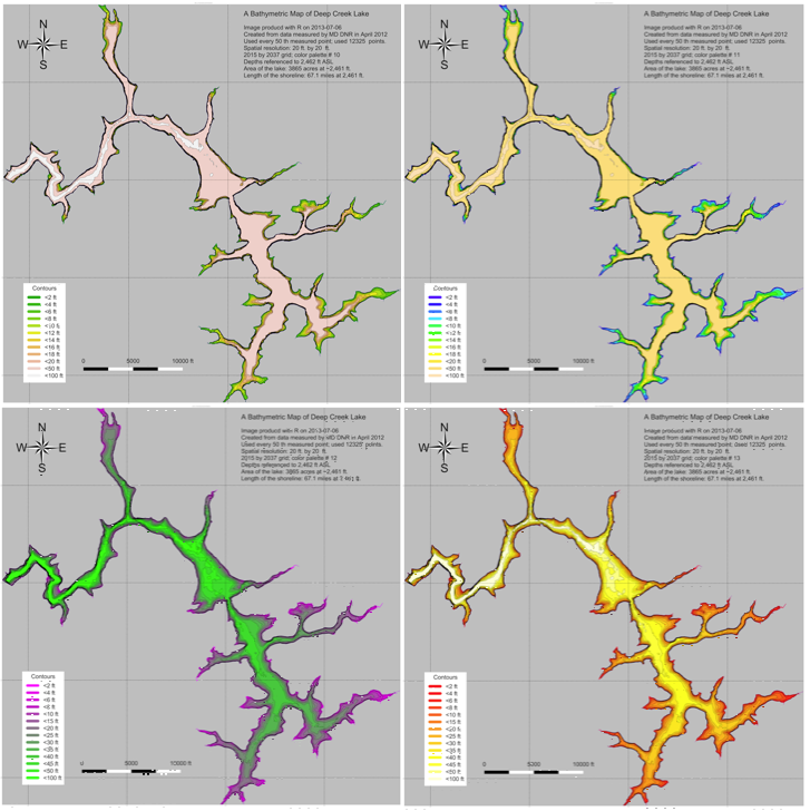
Figure 2. a. Upper Left; b. Upper Right; c. Lower Left; d. Lower Right.
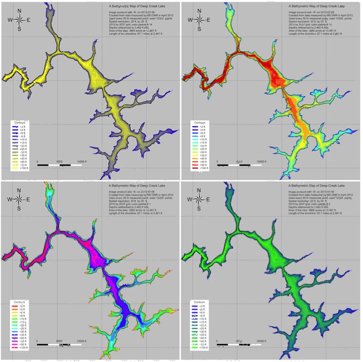
Figure 3. a. Upper Left; b. Upper Right; c. Lower Left; d. Lower Right.
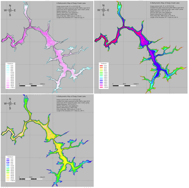
Figure 4. a. Upper Left; b. Upper Right; c. Lower Left.
Figure 5. a. Upper Left; b. Upper Right; c. Lower Left; d. Lower Right.
Figure 6. a. Upper Left; b. Upper Right.
Links to a detailed map for each color scheme can be found at the following:
Scheme 1a
Scheme 1b
Scheme 1c
Scheme 1d
Scheme 2a
Scheme 2b
Scheme 2c
Scheme 3a
Scheme 3b

Scheme 3c
Scheme 3d
Scheme 4a

Scheme 4a
Scheme 4a
Scheme 4a
Scheme 4b]
Scheme 4c
Scheme 5a
Scheme 5b
Scheme 5c
Scheme 5d
Scheme 6a
Scheme 6b